

I’ve been reading a lot of questions in the photographer groups and forums online. One question that keeps coming up is “Should I make this picture black and white or keep it in color?”. The answer to that question is completely up to you (the creator/artist). However, there are some key factors that you should keep in mind while editing your photos. There are also some pretty cool ways to enhance your photos (B&W or color) by using a few editing techniques. For this article, I will be using my live band portfolio for examples of editing in black and white or color. I will also include tips and ideas on choosing which images should be black and white, which should stay in color, and how to make those images pop.
1. “If The Color Isn’t Right, Turn It Black And White!”


(David McGraw from Cattle Decapitation @ Fillmore in San Francisco, CA)
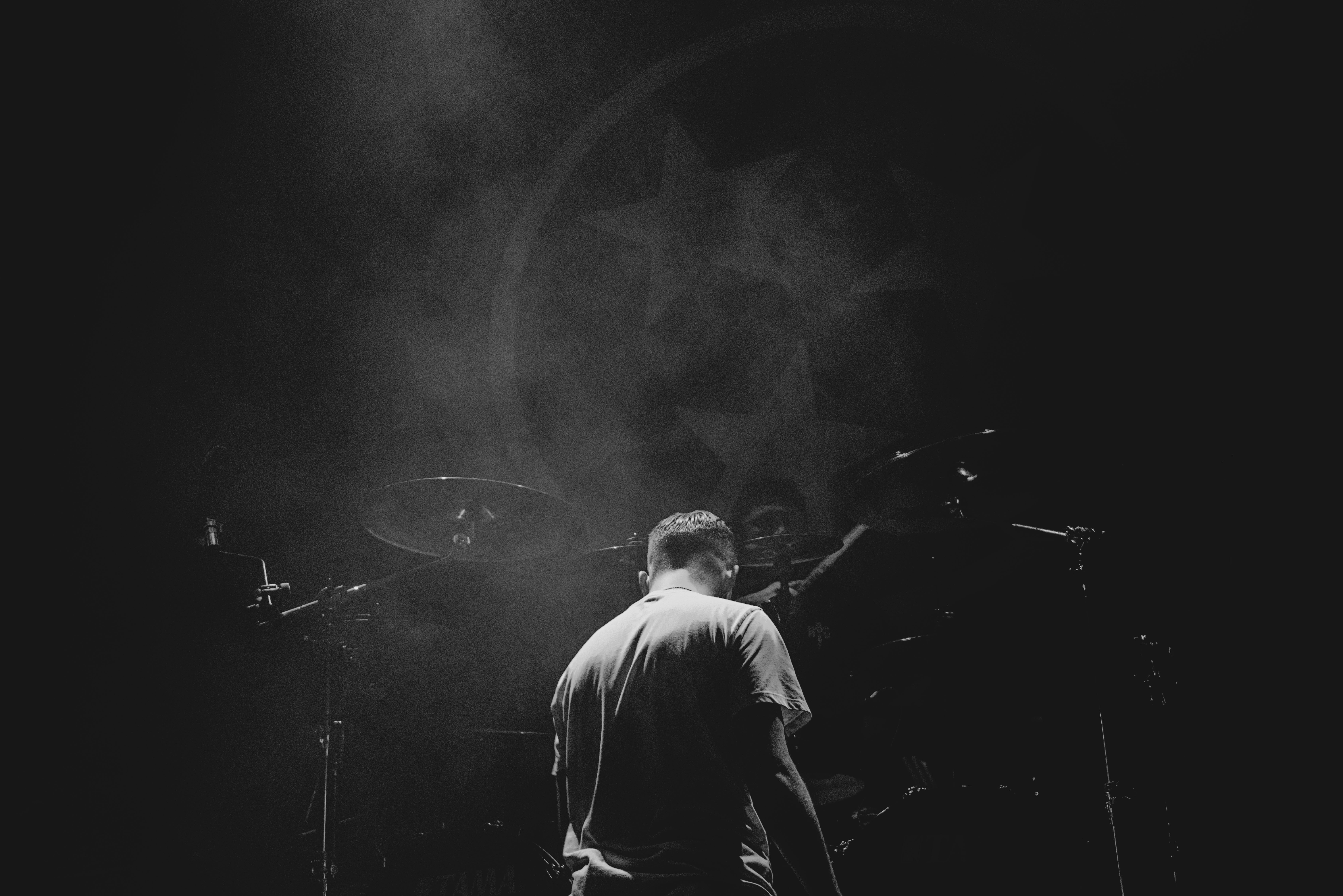
This is a phrase that I tend to go by when editing images (especially live band photography). Sometimes the color is pretty cool and I can mess with it to make a more interesting photograph, and sometimes it’s not. Images that don’t have a great color balance, or visual dynamic, I tend to turn black and white. With this technique, I up the amount of images that I produce. If I hadn’t changed them at all, I wouldn’t have thought they were interesting enough to edit and save. When changing your images to black and white, keep the “color” option open. I’ve gone back and forth with a single image so many times that I just saved BOTH versions. It happens sometimes. I suggest you keep the “black and white” layers in a folder (so you’re organized) and can easily check which version you like best. In this instance, I liked both color and black and white images for the drummer (so I saved both images).
Also, have a preconceived idea as to how many black and white images are too many for your set. If you want to do the entire thing in black and white, that’s cool. Or if you want all color that’s cool too. But know what you want before you enter “the vortex” (editing for en extended amount of time). Sometimes (even if you do have a plan), you steer in another direction, but it’s always best to start with a general idea of what you want your set to look like. I tend to keep a certain percentage of the shoot color/black and white for aesthetic reasons (and a challenge). When I shoot live band photography, I tend to keep the photos 50/50, for fashion it’s more like 1/3 black and white.
When turning a photo black and white, DO NOT do it in your “Camera RAW” window. It will not have the same functional tools to create the perfect black and white photo as Photoshop would. Use the “Black and White” layer option in Photoshop; you can adjust it so much better than in “Camera RAW”. While messing with the “black and white” layer, make sure to keep your highlights from being blown out (too bright; cannot read details), and your shadows from taking over the photo (unless you want it to). Pay attention to your mid tones, sometimes they can get pretty muddy. Keep your mid tones from blending in too much by playing with the B&W layer functions (usually the green/cyan/blue bar controls them) and using the dodge/burn tool to enhance them more. Another way to do it, is to go as far as you dare with the B&W levels and use the eraser tool (on 15%-30%) to slightly bring back the subtle light/dark that you’ve emboldened. A third way, is to be subtle with the black and white layer, and dramatic with the brightness/contrast or the levels layer. Again, you can use the eraser tool to bring back some subtlety.
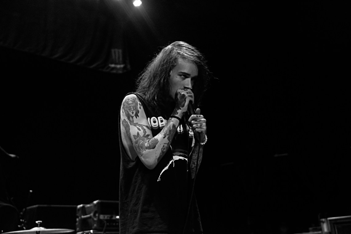
2. DRAMA, DRAMA, DRAMA!

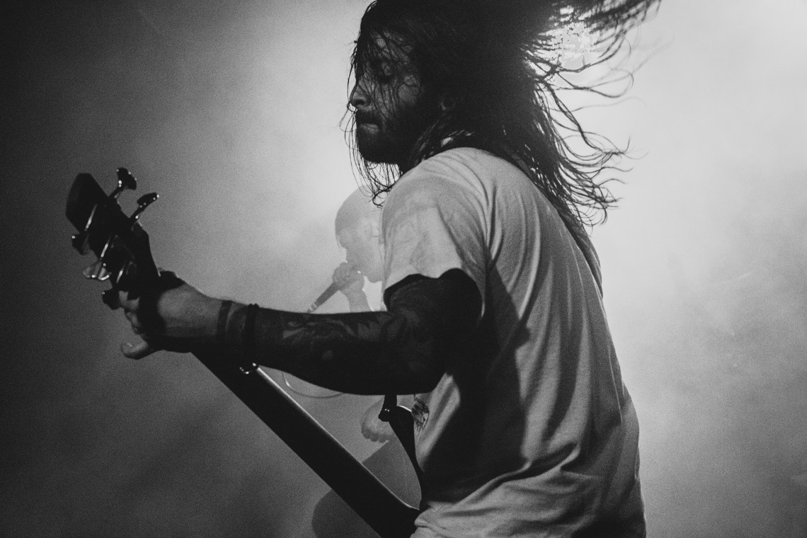
(Phil Bozeman from Whitechapel @ Fillmore in San Francisco, CA)
Even though making a picture B&W automatically makes a photo dramatic, I tend to go for more dramatic looking images to turn black and white (to make them even MORE dramatic). For example the photo above felt more dramatic in black and white instead of color because of the shadow factor. It was an easy choice for me with the spotlight highlighting the lead singer and the shadow surrounding him like a dark, menacing cloud. While working with dramatic effects, it’s best to play with the highlights, mid tones, and shadows. Using the levels, brightness/contrast, and even the curves settings in Photoshop can definitely help with that. Remember to keep the highlights bright, but not blown out, and the shadows dark, but not unreadable. You can also use the dodge (lighten) and burn (darken) tools for more specific detailing.
When looking to make a dramatic black and white photo, you need to START with a dramatic photo first. Look through your images and look for things like backlighting, dramatic framing (rule of thirds, leading lines, etc), shadows you can play with and darken (not too dark). When it comes to mid tones, the biggest mistake you can make is to NOT do anything with them at all. Oftentimes, I darken the mid tones to make the image pop.
3. Grain, Grain, Go Away! (Or Not?)
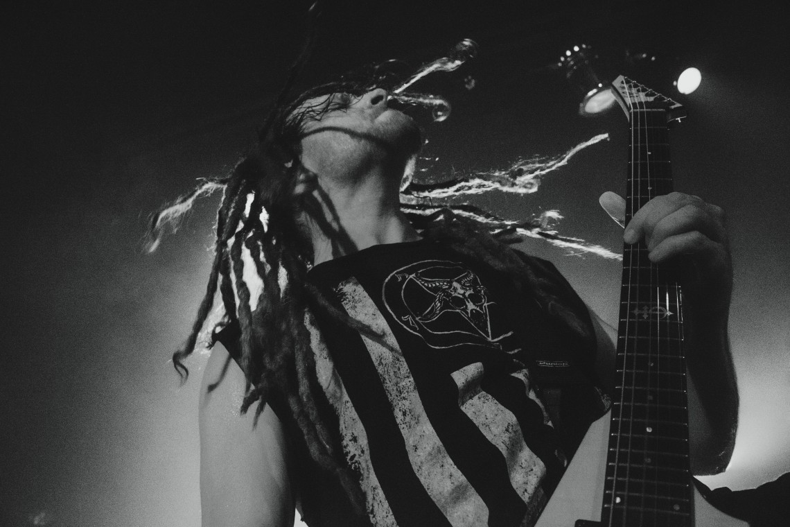
(Adrian Oropeza from After The Burial @ The Catalyst in Santa Cruz, CA)
A lot of the time, we get grain in our photos (sad face), and then we don’t like them anymore. However! By changing the photo into black and white, the graininess becomes more forgiving. In some cases, it even makes the photo better (weird right?). You can fix the grain by doing a few different things.
1. In Camera RAW, go to the two tiny triangles (the detail button) and bump up the luminance (be aware of the detail bar below).
2. Photoshop has a blurring filter called “surface blur”; don’t go overboard with it. After that, to bring back some sharpness/details, use the “high pass” filter.
3. A more meticulous way to do it, is to use the blur/sharpen tool in Photoshop. But I wouldn’t use that for the ENTIRE photograph, just the tiny bits of details I want to refine.
4. Just The Right Amount Of Light
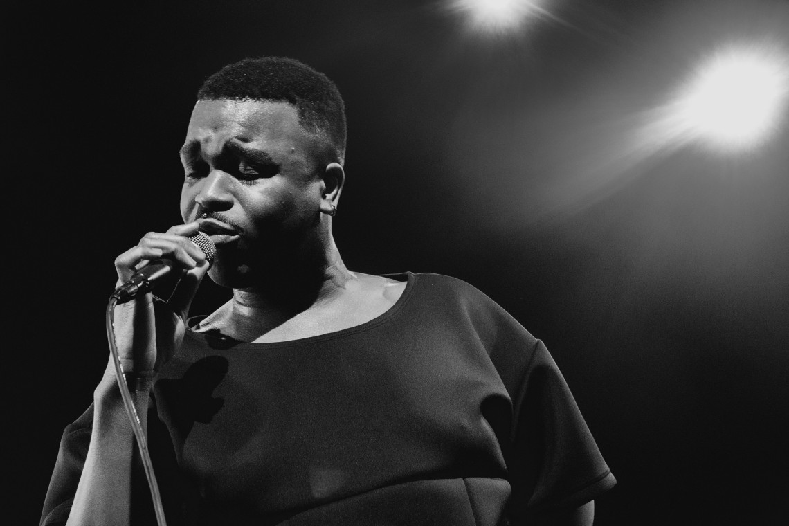
(Cakes Da Killa @ The Independent in San Francisco, CA)
As with all forms of photography, lighting is everything! So when shooting black and white images (or editing them to be black and white), make sure that your lighting situation is on point. Crisp, and clean B&W images are the best. Be aware of your foreground having too much highlight (brightness) and your background being too dark (shadows). To avoid this problem, light the background up (if you can), and calibrate your camera settings to keep the photo in the proper light range (shutter speed, ISO levels, aperture setting). During the editing process, you can change the light levels by using levels (ha!), brightness/contrast, and the curves graph in Photoshop.
5. Stop Playing With Mud
(Mike Spreitze from Devildriver @ The Ritz in San Jose, CA)
I’ve mentioned this earlier (but I see it so often that it needs its own paragraph), but the mid tones will KILL your photos if they’re overwhelming. Having too many mid tones in a black and white photo is a no-no. It becomes muddy, unclear, and uninteresting. Always remember to keep your mid tones in check by using the levels tool and your brightness/contrast bar. A good black and white has all elements to it (darkness, mid tones, and highlights), and it’s well balanced. It’s cool to have a flair in one direction or the other, but never in the middle. So, HAVE your mid tones, but not too much.
6. Don’t Lose Your Cookie-Cutter Shapes
(Noah Sebastian from Bad Omens @ The Senator in Chico, CA)
One of the easiest mistakes to make is to lose your subject in darkness (which I am often guilty of haha!). Especially when dealing with a dark background, in a dark room, with a figure wearing dark clothing (every metal show.. ever). Make sure that everything is visible in the photo (unless that’s what you’re actually going for). An easy way to do this is NOT to go too dark when you edit. Do what you can pre-shoot to light everything up accordingly, but the editing is what makes or breaks your photoset. Another good way to eliminate this issue is to use your dodge (lighten) and burn (darken) tool to enhance or fix outlines. Using the levels, brightness/contrast and using the eraser tool to get rid of what didn’t work out is my favorite way of going about it. You get to keep most of what you accomplished, but take away tiny bits of what ended up being too much.
There you go! Hopefully this advice helps you out with your mission for black and white photography. and I hope you enjoyed my “black and white metal tour across Northern California” haha! If you any further questions regarding this post or any other, don’t hesitate to contact me!

Great Picture. I must say. I really love watching black and white images. So good to watch. As an photographer i can understand how much creativity it requires to capture black and white pictures so appreciate your efforts. I am also an photographer but not that perfect like you but u can have a look at my work at http://www.nitinkhanna.net and let me know how you find it. I would love to hear from photographer like you. Appreciate Your Hard work. Thank you for the helpful article
LikeLike